10. Tampa Bay Buccaneers (1980’s Home)
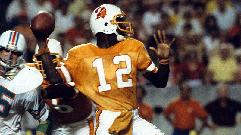
Beautiful, colorful, and oh so original, nothing says bad football than these creamsicle dandies. If you had no idea what decade this picture was taken, just look at that pastel hue. Even though these uniforms are as awesome as they are awful, Tampa Bay was a terrible franchise until they decided to ditch the bright orange for dark orange and pewter. Since then, they are still bad, but they do have a Super Bowl to their name. Yeah, we all miss these Bucs circa 1980, but whenever you feel that longing, just look at Bruce the Buccaneer on that helmet giving you a confident wink and smile…..things are going to be alright.
9. Toronto Maple Leafs (Current Away)

Hockey jerseys are really cool, probably the best of the big four sports. Simple and classic, these white Leaf unis just scream ‘Hockey’, ‘Canada’, and ‘Original Six’. Yes, I like uniqueness and innovation in uniforms, but classic unis definitely have their place in sports.
8. Seattle Supersonics (1980’s Away)

I like 80’s uniforms in general. Much like a young frat boy ‘experimenting’ while being hazed during rush week, the 80’s was a time of uniform experimentation. Also my first sports memories were as a kid in the 80’s, so these unis will always have a place in my heart. These Sonics jerseys are just plain cool and different. Well, the Atlanta Hawks jerseys looked about the same, but I don’t live there and the green and yellow puts it up a notch. Although these threads will never be seen again on the court unless Seattle gets it act together and puts some money on a new arena, they will always be welcomed with fondness here in the PNW.
7. Toronto Blue Jays (Current Home)

I love that logo; that blue jay with his smug and cocky look with a maple leaf in his ear is Canada’s way of saying ‘yeah your country maybe better and more important, but we have this logo on our resume’. But it is not only the logo. The font is pretty darn awesome as well. Oh yeah, I always like blue and white fused together into a beautiful vision of awesomeness. Although their fans are as annoying as the bird that represents their franchise, you cannot and will not criticize their look.
6. Oakland Raiders (Current Home)

When I was a kid, I used to like the Raiders. Please do not hate on this, kids like all sorts of stupid things like Barney the Dinosaur and fart noises. So I am not proud of that phase of my life. I think the main reason why I liked the Raiders were their jerseys. Silver and black are just a way cool combo; ala peanut butter and chocolate or a Frosty and putting the Frosty in my mouth. I know the Spurs are the same colors, and I love the Spurs, but there is something about the way the Raiders sport this color tandem…sort of makes me want to roll into Compton and cap some fools. Also who can resist that logo; Roger Raider giving you that half smile saying that ‘yeah, maybe this franchise has sucked for over a decade, but at least I look good doing the sucking’.
5. St. Louis Cardinals (1940’s Home)
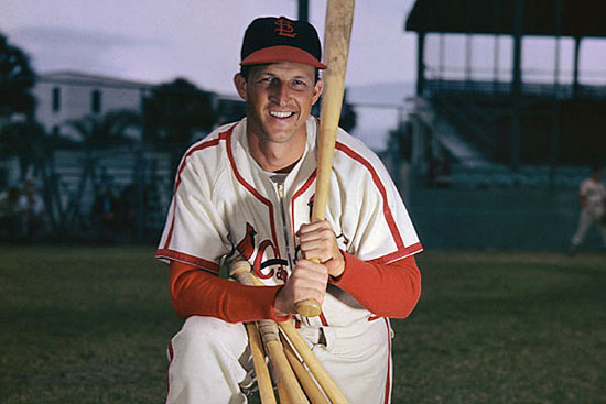
At some point we had to go vintage. And what says vintage more than WWII era baseball jerseys. And what says America more than the St Louis Cardinals. Yeah yeah, there are the Yankees but they engage in imperialism, a very non-American idea. The Cards are the true team of America; in the heartland, loyal fans, humble yet successful. Also look at these jerseys! The logo, two proud cardinals roosting on a bat. The colors, American red and victory white. The piping on the uni, not overbearing but lets you know that this jersey is more than your average MLB wear. If you want to dress for success, next board meeting you attend, don one of these bad boys and watch the respect come flooding your way.
4. Colorado Avalanche (Current Home)

I like color schemes that are a bit unconventional. Miami Hurricanes, green and orange. Carolina Panthers, teal and black. San Diego Padres, brown and yellow. But the best one is the Av’s, maroon and dark blue. No one has dared to do this before, and none after. You know why? Because the Av’s nailed it. To repeat this color scheme would be like remaking the Godfather….why? But it is not just the colors. The logo ‘A’ with the snow storm crossing the letter. The attitude that the team had once donning these bad ass togs, winning a Cup within a decade of their relocation. When looking at Joe Sakic wearing this jersey, well it makes me want to strap on the old skates, check some fools into the boards, and score some goals. Just like what I used to do when I was younger……playing Blades of Steel.
3. Denver Nuggets (1980’s Away)

Here is another 80’s fare. I know, as discussed earlier the 80’s was a time of uniform experimentation. Some have stuck around, some have disappeared, but there are a few that did not last in the field of battle but will always be remembered due to the originality and the social impact they had. This is true with these colorful unis. Wow were these great of what? You get to see the Denver skyline and mountains, you get the see a menagerie of colors spanning the entire jersey, and you get that Nugget font that is a Denver exclusive. Want to know the social impact of these jerseys? Well, before these jerseys Denver had no baseball team, no hockey team, and the Broncos had no Super Bowl trophies. After? The Rockies, the Avs, and the Broncos have 3 Lombardis. Coincidence? Maybe. But you may also think it is coincidence that the sun comes up in the east every day.
2. Seattle Seahawks (Current Away)

OK, I am obviously biased about this. But I really do think the Hawk roadies are really awesome. When Nike acquired the rights to make the uniforms for the NFL in 2012, Nike tried to alter a few of the older uniforms and faced tons of objections. Green Bay’s unis had an extra stripe on the sleeve. NO!!! The Bear’s had a little more detail on the sleeve. NO!!! So all the uniforms were kept the same mostly. Well, except one. Seattle handed the creative reins over to Nike and let them do whatever they wanted. Now some of the reason for this is because their previous togs were god awful. But now, this are god NOT awful. The details on the sleeve, the design that in integrated on the pants and linings, and the color scheme is a winning scheme. If you ever go to a Hawks game, literally 50%+ are wearing a jersey. No, not just a Hawks shirt or hat. The jersey. Also 5 of the top 25 jersey sales are Hawk players. That is huge for a team without a ton of tradition. These road jerseys are the ones that crushed Denver in in the Super Bowl, so not only they making history by destroying the greatest offense ever, they looked great doing it.
1. Houston Astros (1980’s Home/Away)

These are the creme de la creme of all jerseys in history; the orange rainbow of the 80’s Astros. This is just an orgy of color and gaudiness. Who else would be bold enough to combine orange, yellow, red, and more orange into one jersey pattern? The answer: NO ONE!! Only the Astros, a sorry sack of a franchise, has the nerve to boldly go where no one has gone before. Think the Yankees have the courage to do this? No. Think the Red Sox would be so innovative? Of course not. East coasters are too busy smelling their own farts while everywhere else is busy creating awesome sports gear like this. Yes, Nike is at the forefront of jersey innovation with Oregon and others, but the 80’s Astros are the true inspiration for all of this modern day sports style. Finally, a piece of clothing that I can be married in.