10. McDonald’s
Seeing that yesterday was the day that the new tax cuts for corporations were passed in the House, a top 10 corporate logo list seems appropriate. I mean due to this additional distribution of wealth to the most wealthy, we will all be owned by corporations soon enough. So let’s rank the best of the best logos! To start things off, let’s go with the most iconic food logo of them all, McDonald’s. Simple yet direct, McDonald’s golden arches are recognized not only in this country, but in the entire world.
9. PBS
I always liked this logo. It is like a face is popping right out at you saying ‘watch this show…and please send us some money….there is a tote bag in it for you’. Well, maybe not all of that, but seeing this logo makes me reflect to a time where I watched such shows as Sesame Street, Mr Rogers, and Electric Company. And this face/p-shaped logo is still kicking around today reminding you that there is quality programming up ahead.
8. Coca-Cola

If McDonald’s is the most iconic food logo, then Coke has the most iconic drink logo. There is nothing too abstract about this logo, I mean it simply spells out ‘Coca-Cola’. But look at the font. It was an original font for that day, and pretty much created the idea that a font for your product is just as recognizable as what the letters are spelling. I mean if you see this font spell out ‘Seattle Spew’, I bet you would think of Coke first, then what the letters actually are saying. Pretty cool I think.
7. Corvette
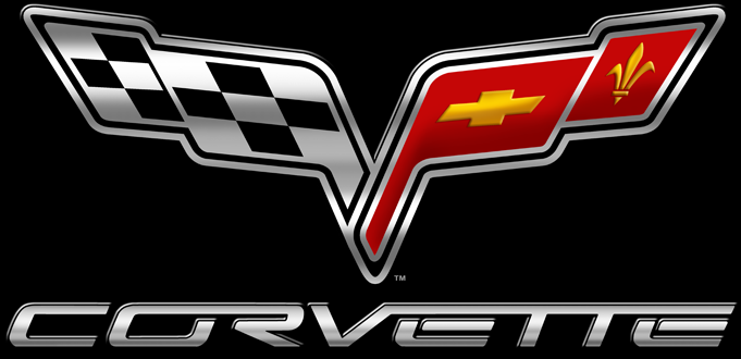
Classy and sporty, Corvette is the star of the American road. And this logo illustrates that fact. What I like about this one is all the little details in the logo; the checkered flag indicating the sports car aspect, the Chevy logo inside one of the flags, the fleur-de-lys referencing the French influence of the car, and the V shape which obviously alludes to ‘Vette’. Also I like Corvettes, so I can’t help but to boost this logo up a few notches.
6. Atari

Even though Atari is technically still around (in some weird bastardized way that no one really recognizes), the company is embedded in our memory as a child of the 1980’s; Stranger Things style. Atari not only brought video games into the zeitgeist in the 80’s, but the idea of technology and innovation. Even though there were plenty of think tanks that were developing computers during this time, Atari is the one that brought it to the masses in a fun and energetic way. To this day, the Atari logo brings back memories of a time when computers, technology, and the digital age were first blooming.
5. Starbucks
OK, let me make one thing clear; I don NOT like Starbucks. Other than they are directly responsible for the Sonics departed Seattle, their coffee is over-priced and their clientele is so annoying. ‘Oh, I want a latte with a sprinkle of cinnamon and nutmeg, but not too much because I have a sensitive palette. Oh yeah, is that whole milk because I have some special dietary restrictions that make me….’ SHUT THE FUCK UP!! Anyway, even though I never go into those hipster-doofus quagmires, I have to admit their logo is top notch. It is recognizable, clear, not too busy but has a solid design to it, and has a cute little mermaid in front. Apparently the original logo had this mermaid with bare breasts, but they had to change it due to the fact pornography is not openly welcome in the mainstream. I like this current iteration best. Nice work Starbucks. Now bring back the Sonics!!
4. Mercedes
Classy and sleek, the Mercedes logo is one we all recognize and appreciate. Whether it is on TV, on a tennis net, or on a gangsta’s gold chain, the Mercedes logo is universally known. I mean there is a reason why kids loved to rip off that symbol off of Mercedes cars back in the day. There is not much else I can say about this guy; a circle, three spokes inside, and not much else. But that is what makes a logo work; simple, distinctive, and identifies itself with the company.
3. Target

Now if you want a logo that identifies itself with a company, well here is the creme-de-la-creme of those. Target!!! I mean look at it….the store ‘Target’ has a logo that is a target. I mean you can’t get any more exact than that. Nothing abstract. No reshaping of letters to spell out something. Not even a new design. It is just a target, like one we have seen years before Target started. I mean it is like the founders saw a target, liked it so much, and preceded to name their store after the logo. But they didn’t stop there, they actually decorated all their stores in only red and white, just like their logo!! I am not sure whether to respect that kind of commitment to their logo or to think they are insane to let their logo be the be-all factor in deciding all of their corporate branding. I’ll go with respect.
2. Apple

Much like the Target logo, the Apple logo is right on the nose. It is an apple. The company name is ‘Apple’. Get it? Anyway, much like most of Apple’s products, their design is not as simple as it seems. Sure, it is an apple, but look closer…..there is a bite in it. See it? That is a sort of different. OK, now look closer…….see how round and symmetrical the apple is? Real apples are much more lumpy. And finally look at that stem. Yes, apples do have stems, but this one has a leaf on it. Aha!! Yeah, I know Apple products are too expensive and they are a malicious company that hijacks the products you buy with updates that are meant to phase out your hardware, but their minimalist designs and seamless user interfaces are what makes them so popular. And their logo, well, it symbolizes this.
1. Nike

It is amazing how the most basic of designs can evoke so many thoughts. I mean all this logo is is a check mark slightly stylized and fattened at the bottom. But this weird check mark is so recognizable across the world that no one sees it as a weird check mark, but a ‘swoosh’. I think Nike is the only company that actually invented a shape with a name. I mean there was no such thing as a ‘swoosh’ before Nike coined the term. Now everyone knows what that word means, and everyone knows what company that related to. Genius huh. Something so simple and seemingly innocuous has had that much of an effect on our psyche. That fact alone puts this logo at the #1 spot. So that’s all the justification I need then. :p
